
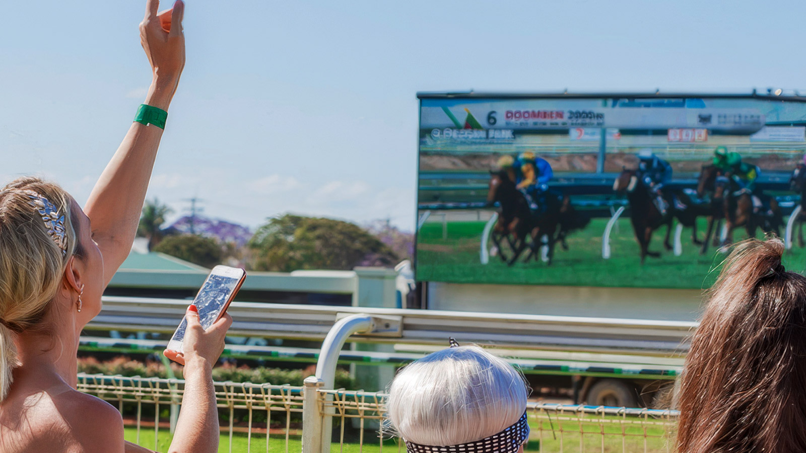
A race day is one of the most concentrated commercial environments in sport. Thousands of spectators, hours of focused attention, a captive audience moving between viewing zones, hospitality boxes, and bars — all of them in front of screens for most of the day. Every one of those screens is revenue inventory. Most racecourses use a fraction of what they own. Here’s how to fix that.
The three places racecourse graphics earn their keep
Racecourse graphics live in three environments, each with a different commercial role.
The big screen. The primary in-venue display. Run-down boards, real-time race data, replays, sponsor segments, live odds. This is where the crowd’s attention concentrates between races and during finishes.
Trackside displays and LED perimeter. Sponsor logos, brand messaging, dynamic ad rotation, live timing graphics overlaid on the track itself. Viewable in-venue and on the broadcast feed.
Internal venue screens. Tickers and digital signage inside the hospitality areas, bars, betting rings, and entry points. Lower attention per screen, but enormous total dwell time across a race day.
Each of these is a different product. Each has its own sponsor profile, its own pricing model, and its own performance metrics. The clubs and tracks that grow sponsorship revenue treat them that way.
What the big screen does well
The big screen is the most visible asset a racecourse owns. It’s also the most under-used. Most tracks run a fixed loop of race data, sponsor logos, and replay clips with little variation. That works as utility. It doesn’t work as inventory.
The big screen earns its keep when it does three things at once.
It carries the race data the crowd actually wants — runners, jockeys, weights, late scratchings, live odds, photo finishes, dividends — with the speed and clarity that lets spectators feel informed. If the crowd is checking their phones for information that should already be on the screen, the screen is failing.
It creates sponsor moments tied to the race rhythm. The countdown clock to the next jump. The replay sponsor. The naming-rights sponsor on the runners list. These should be designed-in, not bolted on.
It supports commercial promotion without breaking the flow. Promo segments for next month’s meeting, hospitality upsells, member-only offers — all delivered between races, never during.
What trackside graphics do well
Trackside is where most of the sponsor money sits, and it’s where the design discipline matters most. The line between strong sponsor presence and visually noisy clutter is narrow. Walk it badly and the venue looks low-rent. Walk it well and the sponsors come back next season.
The principle is brand identity at full strength, but spatially integrated. A sponsor’s logo at the home straight in their actual brand colors, sized for the camera lens it’ll appear on, animated in a way that reads on broadcast — that works. The same logo at the wrong size in the wrong position in default red? That’s a wasted impression.
The second principle is rotation. A digital perimeter LED that holds the same sponsor for the entire meeting is leaving money on the table. The same surface can rotate four to six sponsors per race, each tied to a moment that matters — start, mid-race, photo finish, winner’s circle — and the inventory value triples.
What internal screens do well
The bars, the betting ring, the hospitality boxes, the entry concourse — every one of these has screens, and every one of them is sponsorable space that most racecourses are giving away for free.
A ticker running live odds, upcoming events, sponsor messages, and venue promotions delivers measurable dwell time at every one of these points. Tied to the same graphics platform driving the big screen, the cost of running it is marginal. Sold to the right sponsor, it pays for itself in one meeting.
How to actually price the inventory
This is where most racecourses leave revenue on the table: they price graphics inventory the way they priced printed signage. A logo is a logo, billed by season.
That model is dead. Modern sponsors expect to see the metrics. Number of impressions. Average dwell. Audience size on the broadcast feed. Co-branding alongside named races. These can be measured — broadcast impressions, in-venue camera analytics, screen-time reports — and once they’re measured, they can be priced properly.
A 30-second branded leaderboard segment that goes out on the broadcast feed during a Group 1 race is worth a different number than a static perimeter logo at a Tuesday meeting. The clubs that grow sponsorship revenue are the ones who can articulate that difference and charge for it.
Post-event reporting is the sponsor renewal
Sponsorship renewal happens after the event, not during it. A sponsor who finishes the season without a clear picture of what they got is a sponsor who’s negotiating from a weaker position next year. A sponsor who receives a clean post-meeting report — impressions, segments delivered, broadcast exposure, co-branding moments captured — is a sponsor who renews.
Building this reporting into the graphics workflow itself, rather than as a separate spreadsheet exercise, is the difference between a renewal conversation that’s awkward and one that’s automatic.
Where Lightning Visuals fits
We work with racecourses, race clubs, and racing bodies across Australia, New Zealand, and internationally to deliver big-screen graphics, trackside LED content, internal venue ticker systems, and sponsor-integration tooling. Same platform, multiple outputs, automated to the race schedule. The economics work because the same data feed is doing all of it.
If your big screen is the strongest commercial asset you don’t fully use, we’d love to talk about what it could be doing for you.
Want your racecourse graphics to actually generate revenue? Talk to our team.