
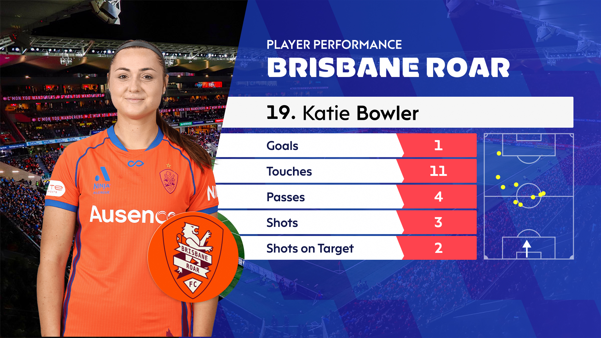
Most viewers can’t tell you what a great live graphic looks like. They can tell you when one is missing. The score that should be there and isn’t. The stat that would have explained what just happened. The leaderboard that’s three seconds behind. Live graphics are infrastructure for fan engagement — invisible when they work, painfully obvious when they don’t. Here’s why they’ve quietly become essential.
What live graphics actually are
Strip away the marketing language and live graphics are the on-screen elements that translate what’s happening in the game into something a viewer can quickly read. Scores. Clocks. Player names. Stat overlays. Leaderboards. Timing splits. Tactical analysis. Each one takes raw data — a number from a timing system, a stat from a feed, a flag from a scoring API — and makes it visible at the moment it matters.
That sounds simple until you try to do it across every screen the audience is watching, in real time, without errors, with the broadcast’s design system intact, and with sponsors integrated tastefully. Then it stops being simple.
Why they matter so much now
Three things have changed in the last decade.
First, audiences fragmented across screens. Viewers watch with a phone in hand, switching between broadcast, social, and second-screen apps. The broadcast has to deliver more value per minute to hold attention.
Second, sports expanded into formats that don’t have a casual viewer. Esports, action sports, niche racing series, women’s leagues building from scratch — these audiences are growing, but they’re not coming with the assumed knowledge a long-running sport has. Graphics are how new viewers build understanding.
Third, the commercial model changed. Sponsors increasingly pay for measurable visibility — and graphics are where measurable visibility lives. A logo on a leaderboard, a co-branded stat, a sponsor-driven segment — these are inventory that didn’t exist when graphics were just scores and clocks.
How they deepen the experience
Good live graphics do more than display information. They tell the story of the event as it unfolds.
A marathon graphic doesn’t just show split times. It shows the race developing — who’s pushing, who’s fading, where the surge is coming from. A racing leaderboard isn’t just positions. It’s the gap closing, the strategy unfolding, the moment the leader changes. A cricket graphic isn’t a stat readout. It’s tension visualized — required run rate, balls remaining, fielder positions, all updating in real time.
This is visual storytelling, and it works because the human brain processes spatial and visual information faster than text. A graphic that takes a half-second to read communicates more than a commentator can say in five. That’s why graphics are the unsung hero. They’re doing narrative work the broadcast couldn’t do any other way.
How they help less-familiar sports
Casual viewers stuck on an unfamiliar sport — chess, rugby, Formula 1, kabaddi — face the same problem: they don’t know what they’re looking at. The rules are opaque, the structure is unclear, the names mean nothing.
Live graphics fix this. Position diagrams, formation overlays, possession indicators, move predictions — these aren’t decoration, they’re translation. A viewer who would have switched off after ninety seconds stays for the whole event because the graphics taught them what to watch. The sports that use this well grow their audience. The ones that don’t lose viewers they didn’t need to lose.
How they fuel social conversation
Live graphics are also social infrastructure. The free-kick success rate that appears before the kick is taken — that’s the social media post that follows the kick. The stat overlay that flashes during the play — that’s the meme. Every well-designed graphic is also a screenshotable, shareable, debatable artifact that extends the broadcast into the rest of the internet.
For fantasy sports, this matters even more. Participants make decisions in real time based on what the broadcast tells them. The richer the graphics, the more strategic the play, the longer the engagement.
How they create commercial value
The last decade has taught rights holders that graphics aren’t a cost — they’re inventory. A trackside graphic seen by a billion viewers is worth more than a board no one looks at. A stat overlay co-branded with a sponsor delivers measurable engagement. A leaderboard sponsored by a timing partner is a recurring revenue line.
This is what we mean when we say graphics are a revenue surface. It’s not about cramming logos onto a broadcast. It’s about treating every visual element as a designed, measured, optimized opportunity to deliver value to a sponsor and information to a viewer at the same time.
The unsung hero gets a long-overdue credit
Live graphics have quietly become essential to how live sports works. The next time you watch a broadcast, pay attention to them. Notice when a stat answers a question you didn’t know you had. Notice when a leaderboard makes a race make sense. Notice when a graphic disappears and the broadcast feels suddenly hollow.
That’s what we build for. We treat live graphics as the storytelling layer they actually are.
Want live graphics that do real storytelling work for your audience? Let’s talk.